Most delivery dashboards fail for one simple reason. They look good, but they do not help anyone make decisions. Engineers ignore them. Product teams stop trusting them.
Leadership asks for separate updates anyway. A reliable delivery dashboard should not impress people. It should help them act.
This guide explains how TPMs can build delivery dashboards that teams actually use, trust, and rely on. You will also see examples, metrics, and practical templates you can adapt immediately.
Why Most Delivery Dashboards Fail
Before building anything, it is important to understand why dashboards usually fail. Common reasons include:
- Too many metrics
- Unclear ownership
- Outdated data
- Vanity charts
- No clear audience
- No link to decisions
A dashboard that tries to serve everyone ends up serving no one. A good TPM starts with intent, not tools.
Step 1. Define the Audience Clearly
Every dashboard needs a primary audience. Not multiple. One.
Ask this first: Who is this dashboard for?
Typical audiences include:
• engineering teams
• product managers
• leadership
• program stakeholders
Each group needs different signals.
Example
If your audience is engineering leads, they care about:
• blockers
• dependencies
• stability
• flow
If your audience is leadership, they care about:
• delivery confidence
• major risks
• cross team alignment
Do not mix these on one dashboard.
Step 2. Define the Decisions the Dashboard Should Enable
A dashboard without decisions is just decoration.
Ask: What decisions should this dashboard help someone make?
Examples of real decisions:
- Do we ship this sprint
- Should we reduce scope
- Where is the biggest risk
- Which dependency needs attention
- Do we need leadership support
If a metric does not support a decision, remove it.
Step 3. Choose Metrics That Reflect Flow, Not Activity
Teams often track activity instead of flow. Activity looks busy but hides problems. TPMs should focus on flow metrics.
Core metrics every delivery dashboard should consider
Delivery status
Clear signal. On track, at risk, off track.
Cycle time
How long work takes from start to finish.
Lead time
Time from commitment to delivery.
Work in progress
Too much WIP slows everything down.
Blocked items
What is currently stuck and why.
Dependencies
What work depends on other teams or systems.
These metrics tell you how work moves, not just how much work exists.
Step 4. Keep the Dashboard Small and Focused
A reliable dashboard fits on one screen. If someone needs to scroll, you already have too much. A good structure looks like this:
Section 1. Program health
Simple status indicator.
One sentence summary.
Section 2. Key risks
Top three risks only.
With owner and mitigation.
Section 3. Flow metrics
Cycle time trend.
Blocked items count.
WIP status.
Section 4. Dependencies
What is waiting on whom.
What is critical this week.
That is enough.
Step 5. Use Clear Language, Not Tool Language
Dashboards fail when they sound like Jira exports. Avoid labels like:
• ticket velocity
• backlog throughput
• sprint burn
Instead, use language humans understand. Examples:
• work waiting for review
• items blocked today
• delivery risk this sprint
• dependency causing delay
Clarity builds trust faster than precision.
Step 6. Make Ownership Visible
Every signal on the dashboard should have an owner. Not a team. A person. Example:
Risk. API scalability at peak load
Owner. Backend lead
Mitigation. Load test scheduled by Friday
When ownership is visible, follow ups become easy and blame disappears.
Step 7. Update Cadence Matters More Than Perfection
A slightly imperfect dashboard that is always updated is better than a perfect dashboard that is stale. Decide the update rhythm clearly:
- Daily for engineering flow.
- Weekly for leadership view.
Automate where possible. Manually update where judgment is needed. TPMs add value by interpreting data, not just displaying it.
Step 8. Review the Dashboard With the Team
Do not build dashboards in isolation.
Review it with:
Engineering leads.
Product managers.
Stakeholders.
Ask simple questions:
Does this reflect reality?
What feels missing?
What feels useless?
Then remove more than you add.
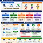
Example. A Simple Delivery Dashboard Template
Here is a simple template you can adapt.
Program Health
Status. At risk
Summary. Dependency delay may push testing by two days
Top Risks
- API performance under load
Owner. Backend lead
Mitigation. Load test scheduled - QA capacity next sprint
Owner. TPM
Mitigation. Scope adjustment under review
Flow Signals
- Average cycle time. 6 days
- Blocked items. 4
- WIP above limit. Yes
Dependencies
Waiting on payments team for schema update, target resolution. Thursday
This dashboard tells a clear story in less than a minute.
Common Mistakes TPMs Should Avoid
- Tracking too many metrics
- Mixing audiences
- Hiding bad news
- Over automating without context
- Not revisiting the dashboard regularly
A dashboard is a living tool, not a one time deliverable.
How a Good Dashboard Builds Trust
When teams trust the dashboard:
- Meetings become shorter
- Escalations become earlier
- Delivery becomes predictable
- Leadership stops asking for ad hoc updates
That is real TPM impact.
Final Thought
A reliable delivery dashboard is not about charts. It is about clarity. If your dashboard helps people decide faster, act earlier, and trust the plan, you have built the right thing. As a TPM, your job is not to show data. Your job is to turn complexity into clarity.
Built for TPMs who own outcomes, not demos. https://www.tpmnexus.pro